


Building an epaper laptop: Dithering
18th January 2026 - Epaper laptop , Series
Epaper screens come in many variants. The classic one that most people think about is only black and white. However most newer panels are at least capable of greyscale, and the best in class are colour. But the colour and greyscale isn’t “true” colour and greyscale, but rather they have a set of greyscale levels or a small set of colours they can display. Some digital signage variants have black, white, and one or two contrast colours, other variants like the ones found in e-book readers either have a set of colours they can display, or fairly low-fidelity RGB (compared to normal screens). The panel I’ve chosen for this project is black and white and capable of 16 levels of greyscale. Part of the reason for this choice was of course availability at the time, but also that epaper panels with colour is considerably slower and often offers lower contrast1. The panel I’ve chosen can be driven very quickly in black and white mode, and slower in greyscale mode. This means that there’s a trade-off to be made about speed and graphical fidelity. Use cases such as e-book readers or picture frames typically trade for graphical fidelity. If you’re going to spend a minute to read a page of text you don’t care about a couple extra tenths of milliseconds to render it nice and crisp. And if you are updating a picture that will stay on a wall potentially for days you don’t care about a couple seconds of refresh time. Making these trade-offs require that you have the ability to reason about the usage patterns of the underlying system so that you’re able to design around the limitations you choose. For a general purpose computer which more often than not will run software that isn’t optimised for epaper I considered speed to be more important. In this article I will discuss a lot of various dithering algorithm, unfortunately the article would be twice as long if I went into detail about every single one. If you want to know more about many of these algorithms I recommend Image Dithering: Eleven Algorithms and Source Code by Tanner Helland as a good starting point. After that you should be able to keep up, albeit with some occasional Googling to look up specifics on the algorithms he don’t mention. I go into the basic concept of the various methods however, so you should be fine reading this as a stand-alone article as well.
So what is dithering?
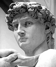
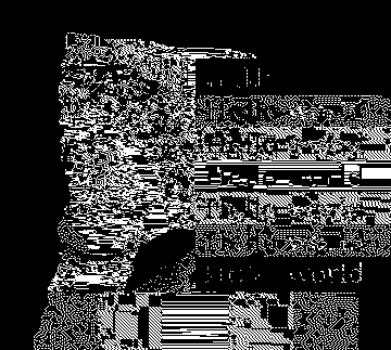
For maximum speed we’re stuck with only using black and white, and even if we wanted to implement a full-fidelity mode we would be stuck with only 16 levels of greyscale. And this is where dithering comes in. The most naïve way to turn an image into only black and white would be to apply a simple threshold, any pixel darker than half grey would appear black, and any pixel brighter would appear white:
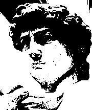
As you can see this doesn’t look particularly good, we are able to make out the subject, but a lot of detail is understandably lost. However if we apply some dithering we trick our brains into seeing more details:
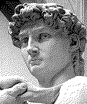
This image is still only composed of black and white pixels, but now the density of the black pixels makes our brain think there are more levels of greyscale than what is actually there.
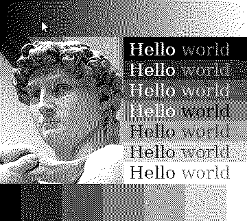
Going into this project I thought that dithering would be one of the simple parts, after all dithering has been used for ages to improve graphical fidelity in systems with limited palettes. So we could simply pick whatever is the “best” dithering algorithm and off we go! Unfortunately this wasn’t the case. Many of the reasons seems to stem from when these approaches where made and the hardware they where made for, but some of them are more technical in nature. One of these historical issues is that these algorithms were mostly designed to display images on black and white screens in an otherwise controlled environment. So all the menus, windows and buttons would be carefully hand drawn, and the dithering algorithm would only be called upon to show images. This means that a lot of dither algorithm evaluation and comparison is done on simple images like the ones shown so far in this article. This isn’t the system we will be using the algorithm in however. Of course I’ll carefully set up the theme and icons to work well on the display. But what other programs, and maybe especially the web, does is out of my control. Therefore I’ve constructed a test image which I’ll use throughout this article which combines an image, some gradients, some solid coloured blocks, and some text on various backgrounds:
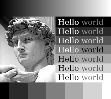
To simulate text that could be found in actual interfaces the “Hello” words are either completely black or completely white, and the “world” words are set with a colour selected to be the lowest possible level of contrast that still achieved “good” on Coolors contrast checker. We’re unfortunately not always so lucky as to have “good” contrast in UIs and on the web nowadays, but if a designer actually chose a good contrast we should try to render it well.
The trouble with error-diffusion
The dithering algorithm used in the example above is a fairly classic algorithm called Floyd-Steinberg. Here it is again on my test image:

Floyd-Steinberg is a so called error-diffusion algorithm that works by going through all the pixels from the top left and as pixels are quantised to black or white it spreads the error of the quantisation to nearby pixels. It’s a bit hard to explain without a visual aid, so I made this:
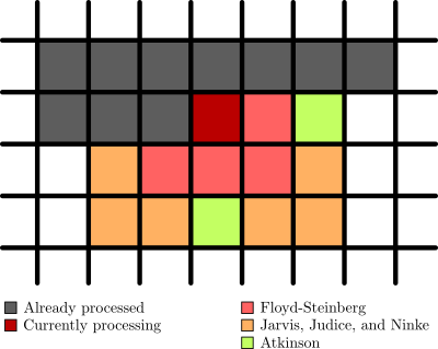
As you can see the pixels are processed from the top left going left to right (in grey), then the pixel currently being processed (in dark red) spreads the error out to nearby pixels. There are multiple of these algorithms with different ways to spread the error which I’ve also included in the image. So Atkinson dithering spreads the error to the same pixels as Floyd-Steinberg, but also two extra pixels. And Jarvis, Judice, and Ninke spreads it out to a whole lot more pixels. The error also isn’t spread out evenly, and in the case of the Atkinson dither not all of the error is spread out.
When processing a pixel the original colour of the pixel is added together with the error and the result is quantised. This leads to an image where shades of grey are smoothed out nicely, and sharp edges still retain a hard contrast. It is also quite a fast approach for linear computation, i.e. running on a CPU, processing one pixel at a time. But if you want to parallelize it you run into issues with pixels being dependent on the result of the pixels that come before them in the image. Change the top left pixel and you risk having your entire image change. This is no good when we want to compute multiple pixels simultaneously.
Another issue is that things like moving the mouse or a blinking cursor could cause a lot of changes in the output image because the change in error propagates through the image. These two pictures look almost identical to us, the only difference in the input image is that the cursor moved one pixel to the right and down, but on the right you can see the difference in the Floyd-Steinberg output:

This would be noticeable enough as flickering pixels on a normal display, but when you factor in the slight ghosting of an epaper screen you end up with a persistent grey “lightning” across the screen. With this ghosting the difference in the third image would be clearly visible on the screen even after the movement stopped.
The underlying problem, which I’ll call the dependency problem as it is caused by pixels being dependent on the output of previous pixels, is present in all Floyd-Steinberg style algorithms. And there are quite a few of these, after all they are typically the kind of algorithm which produces the best visual results. In terms of the dependency problem there are some slight differences though. Jarvis, Judice & Ninke is more affected because it spreads error to more pixels; Atkinson is slightly better because it “loses” error; and Riersma, which diffuses error along a Hilbert curve instead of out from the top left, is slightly less affected but performs worse in general and is even harder to parallelize. The dependency problem is the first of the technical issues, and maybe the most critical one.
Another issue with these algorithms is what I call the warm-up problem. Since the algorithm works by “pushing” error ahead of the processed pixel there are cases where the context stored in this error doesn’t match the current part of the image. If you look at the top left of the sample image you can see that the area of white pixels almost have a rounded appearance. The gradient in the source image is completely linear and this effect is simply caused by the algorithm not having any error context to pull from for these pixels. This means that until sufficient error is accumulated the algorithm doesn’t know what to do. There is a similar phenomenon whenever the image switches context, most visibly in this image in the first grey block on the bottom next to the completely black one. The image above is bright, and with the sudden change to dark grey the top-right row of pixels end up completely black creating a visible artefact.
These might seem like nitpick on an otherwise great algorithm, but both these problems are caused by a general dependency of context. In addition to being bad for parallelization this causes another problem. Since epaper panels are static once they are updated many of them support partial updates meaning that only the area of the screen where something changed will be updated. This saves a lot of power and one of the major goals of an epaper laptop would be great battery life. In addition to saving power it also means spending less time on each update, which directly impacts input latency. So we definitely want to take advantage of partial screen updates! With an error diffusion algorithm it is much harder to perform these partial updates because in order to dither a small region of the image not only must we have the context for the part we want to update, but we also need to potentially update everything below/around it.
Out of all the algorithms in this category I found Riersma was the most promising in terms of the dependency and warm-up problems, but it is very hard to parallelize and do partial updates with. Jarvis, Judice & Ninke might perform a hair better than Floyd-Steinberg in graphical fidelity (especially in some edge cases with light gradients). Atkinson dithering looses a bit of error as it goes along, effectively changing the contrast of the image slightly while easing some of the dependency problem. But all of these suffers from the “lighting strike” effect whenever pixels are updated, so for the general part of the renderer they aren’t a good match. And while they are easier to parallelize than Riersma they’re still not great. I’ll keep them around for high-fidelity modes though as there are use cases where I want to look at static images and they still produce the best results, especially for the 16 shades of grey mode which is already slow enough that you wouldn’t want to use it for much else anyways.
Other approaches
Fortunately error-diffusion isn’t the only thing that can be used to dither an image. Imagine we want to turn an image composed of a single shade of grey into a dithered version. If the shade is about 30% black then we’d expect 30% of the pixels in the output to be black. The problem is just how we select these 30%. One approach would be to determine the threshold for a pixel to turn black or white depending upon where in the image it is, making sure to pick these thresholds such that they match our intuition about percentages of pixels. This is what’s called ordered dithering, pattern dithering, or positional dithering. A big benefit to not having any context (save for the pattern itself) is that every pixel can be individually processed in parallel on a GPU. On an epaper laptop I assume the GPU will go mostly idle anyways, and since almost all general purpose CPUs nowadays comes with a GPU it would be a shame not to utilise it. For such ordered dithering there are many different patterns we can use, perhaps the most well known being a Bayer matrix. Compared to error-diffusion algorithms though, the result is a bit lacklustre: 
This doesn’t suffer from the dependency problem, nor the warm-up problem. But we have some new problems, the first of which I call the pattern problem. As you can see the pattern of the dithering mask is clearly visible in this image, which can be quite distracting. The error-diffusion algorithms also suffers from various degrees of the pattern problem, but it’s more obvious here as the Bayer matrix is a very small pattern, so the repetition is clearly visible. An alternative to avoid the obvious patterning is to use a blue noise pattern: 
Because the “pattern” here is just noise it is no longer as discernible in the output, in this image the pattern is the same size as the image. If you tiled a smaller pattern you could be able to discern some structure, especially in large single colour areas, but a lot of the repetition is hidden by the noise. Since the size of the monitor is known I can easily just create a blue noise pattern for the entire screen, so this test is more realistic. The second problem is what I call the transition problem. Since there is no context from surrounding pixels hard edges are often softened up. Especially the text is harder to read compared error-diffusion dithering because the hard edges are preserved better and even the Bayer matrix performs better because the pattern is much less organic. The boxes around the text and along the bottom also has fuzzier borders, and even Davids sharper features are a bit softened. Applying a different threshold to every pixel like what both the Bayer matrix and blue noise does will indeed give us the right amount of black pixels, but in a way it means that we lose resolution. The sharp transitions from one colour to another doesn’t quite resolve properly and appear noisy in the output image.
Another algorithm fitting in with ordered dithering is a dither which uses some simple functions to generate what is effectively a pattern on demand. This is nice if you don’t have memory for the pattern, but for my use case it would probably be faster to use the algorithms to generate a pattern and then do the dithering on the GPU. The visual results are somewhere between Bayer and blue noise, here the 3rd pattern is shown: 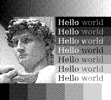
There is a bit of the patterning problem, although less than with the Bayer matrix. There’s also some of the transition problem, but the increased pattern means it appears less like a blur and more like an artefact for better or worse.
I’ve spent a lot of time trying to squeeze more graphical fidelity out of these ordered dithering methods. For example the resolution of the panel I’m using is high enough that a perfect chequerboard looks almost indistinguishable from the 50% grey colour in the 16 colours mode. This means that the Bayer matrix dithering actually looks better on the panel itself than if you’re looking at this on a regular screen. It also means that the blue noise pattern looks slightly worse since it never features this pattern. So I tried to create a hybrid, a blue noise pattern, but reorganised such that it would create chequerboard grey. 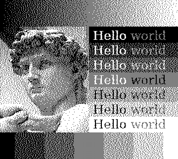 It works in the sense that it creates that nice chequerboard for the 50% grey, but it now has some clustering which doesn’t look great. All in all I’d say it’s about par on the real panel, maybe only a touch better. When using methods that feature chequerboard grey, which the Floyd-Steinberg method also does, I’ve found that applying a slight filter that pushes colours towards full black, half grey, and full white will make certain scenes better. Certainly something I will experiment more with in the future.
I also tried to use some edge-detection algorithms and use the result of those to influence a blue noise pattern, in this way hoping to get slightly crisper edges while still retaining that organic look. 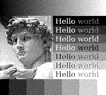 It does work, but I’ve struggled with tuning all the parameters right to get a good effect. The pattern used for the above image is made by creating an edge-detection of the input manually in GIMP with the “Difference of Gaussians” method which was then level adjusted to be more more black and white. This edge-detection was then used as a mask for a half grey image over the blue noise pattern. A half grey pattern is the same as simple thresholding so essentially this makes it so that hard edges switches to thresholding while the rest is blue noise dithered. The effect is subtle, but it does reduce the transition problem making the text slightly easier to read, and the crispness of Davids features are slightly improved. However these edge-detection algorithms aren’t computationally cheap, and I’m not sure if the juice is worth the squeeze so to say.
New GPU-based error diffusion?
So error-diffusion creates pretty results but doesn’t really work for this use-case, and the ordered dithering which is easy to use for this use-case suffers quite a bit quality wise. So what can we do, is there some kind of middle ground thing we could use? As I mentioned in the introduction most dithering algorithms where designed a long time ago because they where relevant for monochrome monitors back in the days (or even just limited palette displays). So they are optimised for that era of hardware. Floyd-Steinberg for example touts that it can dither the image in a single forward pass, and the division factors are calculated such that you can do the maths with simple bit shifts. And don’t get me wrong, this is very cool and actually means that you can run these algorithms on a single thread with decent performance. But nowadays we have GPUs that can render realistic lighting at over hundred frames a second. So can we leverage this resource which will mostly be dormant on this machine anyways? Implementing ordered dithering algorithms on the GPU is pretty trivial as each pixel is individually processed. But as I discussed before the normal error-diffusion algorithms are hard to get running with good performance and aren’t all that suited for my use case anyways because of the large updates and ghosting. There have been a little interest in the field of GPU based dithering. Some papers have been written about it, but they are mostly about running existing algorithms on new hardware. There have been a few algorithms built specifically for GPUs, but many of those are simply the same error-diffusion techniques but applied to chunks in various patterns. For example applying Floyd-Steinberg in small circular chunks instead of across the entire image. These do solve the whole image-spanning dependency issues, but the individual chunks still suffer from the warm-up problem which means that they are often very obvious. There are also some great algorithms that do error-diffusion on the GPU but which just simply takes too long, including one paper that touted doing about 4x the resolution I’m looking at in 7.2 seconds using an Nvidia GTX 780Ti. The results look good, but I neither have the horse-power nor the time to use something like that for a real-time system.
I tried my hand at creating something myself, inspired by both ordered dithering techniques and error-diffusion algorithms. It is created for GPUs and works by splitting the image into very small chunks (like 3x3 or 5x5), then considering how many black pixels that chunk should contain by the average grey level and placing those pixels on the darkest original pixels while also applying a small bit of noise and diffusing some error to nearby pixels to avoid clustering. The results are decent, words are crisp, and so are Davids features, but you can tell that it is done in chunks and it struggles a bit with hard transitions.

It’s not terrible however and the idea of a GPU based dithering algorithm stuck with me. And in my seemingly infinite search for a dithering algorithm that could work I stumbled upon an algorithm called Dizzy Dither. It does error diffusion, and the author compares the result to blue-noise dithering. However in the article introducing the algorithm they only ever test it on a picture. In my benchmark I would actually say that it outperforms blue-noise dithering.  The general organic, noisy feel of blue-noise dithering is still there, but text gets better sharpness, the features of David are made a bit more distinct. On top of that it doesn’t suffer from neither the dependency problem nor the warm-up problem. The way it works is by randomly selecting pixels to dither, diffusing errors to nearby pixels. This means that only some pixels will have error taken into account while dithering, about three quarters in my testing. It also means that error, while it theoretically can traverse the entire image, tends to stay very localized. Doing the same test with the cursors from above we can see this clearly:


Since error doesn’t propagate far the dependency problem is much smaller and partial updates can simply be done by just padding the affected region a bit. And since it isn’t troubled by the warm-up problem even not increasing the area will lead to completely passable results. When considering all of this I had an epiphany. If the dependency problem is so small, and many pixels don’t even see any errors before being dithered it should be possible to handle more than one pixel at a time. And sure enough, by creating a pattern consisting of multiple layers of randomly selected pixels until the entire image is filled the algorithm can be run on the GPU! Each layer contains the same amount of pixels, and no two pixels in any given layer can have their error propagation region overlap (otherwise the GPU would try to write to the same memory at the same time for two different pixels). Other than that it’s pretty straight forward, and the visual results are pretty much the same as the single-threaded version. Depending on how big the pattern is you do get some patterning on large fields of single-coloured areas, but by simply improving the randomness of the pattern generation process I hope to be able to fix this.
Speed comparison
When comparing the speed of these algorithms it really comes down to CPU vs. GPU processing. For example performing Floyd-Steinberg is about 1.9x slower than doing blue noise ordered dithering on the CPU in my naĩve implementation. But performing Dizzy Dither and blue noise dithering (speed on the same order of magnitude) on the GPU is about 280x faster than CPU bound Floyd-Steinberg for an image of the same resolution as the monitor I’m going to use for my project. So dithering on the GPU (or even on specialized hardware) is definitely the way to go for a project like this.
Final remarks
As you might have noticed this is something I’ve been thinking about a lot, this might even be my longest article to date. And in fact this isn’t even the first time that I was “done” researching the topic and ready to select an algorithm just to nerd-snipe myself as I was typing up my findings. I’ve done a lot of research into all kinds of different algorithms and implemented a whole lot of them to compare results on the test-image used in this article. What’s presented here is only a small sample of the things I’ve tried and looked into, a lot of the things I looked at where either just dead ends, or weren’t interesting enough to warrant making this article longer. To allow my work to be more easily replicated and improved I will make the code for my algorithm tester available on GitHub if anyone wants to poke around with these algorithms. I believe there are yet some great dithering algorithms to be discovered, and by using GPUs or maybe even NPUs I think we can get good results at great speeds. If anyone ends up developing something interesting in this space, please let me know! But for now I think I will finally close the chapter on dithering. For the epaper laptop I will go for using my GPU implementation of Dizzy Dither for normal usage, and then include other algorithms like Floyd-Steinberg for high-fidelity modes. I will also do some more tricks to improve the actual experience of using the laptop in an upcoming article on writing the driver and integrating the dithering algorithms. Since the entire thing will be running alongside the OS and not simply as some dumb screen we have a lot of options for handling windows, the cursor, and using hotkeys to improve upon common pitfalls of epaper computers, so stay tuned for that!
-
I recently upgraded from my Kindle 4 to a PocketBook Verse Pro Colour (one of the few options with physical buttons), and while it’s a great device the white background is slightly darker than the Kindle was. So while I never missed a backlight on the Kindle 4 I almost always have a slight backlight on with the PocketBook, just enough to counteract the grey background.↩︎